BRAND MANAGEMENT
Case Study:
Cohen & Co
When I joined Cohen & Co in 2019, the challenge wasn’t just design—it was translating highly technical financial expertise into a visual language that could stand toe-to-toe with multinational firms. I was brought on to do one key thing: elevate the firm’s visual presence so it could confidently compete with larger, multinational firms in winning new business.
What began as a refresh quickly became a broader brand evolution. Over the past seven years, I have reimagined how Cohen & Co shows up visually—transforming dense, technical content into bold, clear, and modern design systems that balance creativity with credibility.
My work focuses on clarity, consistency, and impact. Through refined typography, a stronger use of color and imagery, and a more intentional approach to layout and storytelling, I’ve helped shape a visual brand that feels contemporary, confident, and distinctly Cohen & Co.
The work below captures that journey, showcasing the transformation of the firm’s visual identity from before I was hired to where it stands today.

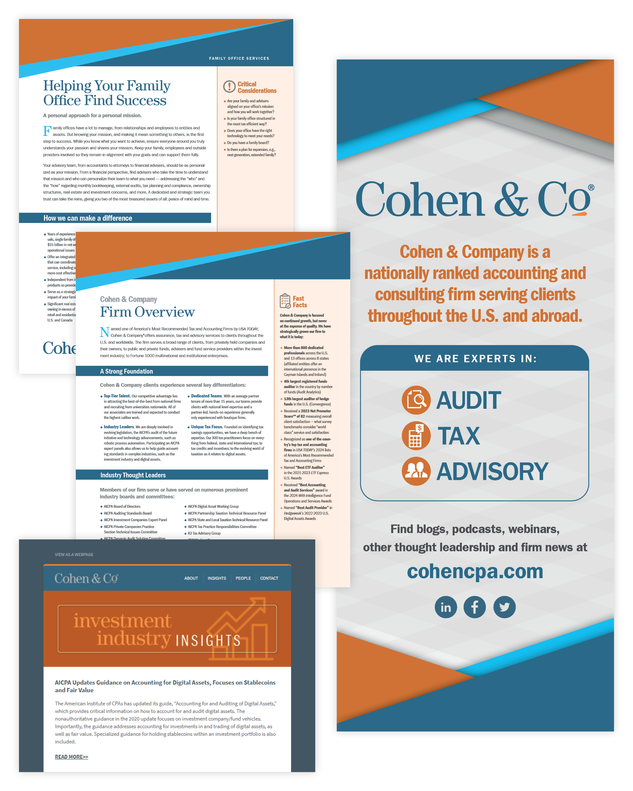
Functional, but Fragmented.
Early materials before my arrival were created primarily in Microsoft Word, with little visual hierarchy, brand consistency, or strategic direction. Design decisions were reactive rather than intentional, resulting in documents that conveyed information, but not confidence.
Graphics were largely sources from PowerPoint, photography was dated, uninspiring and overall lacked the energy and excitement that was part of Cohen & Co’s growth story.
Flying the plane as we built it.
The first couple of years were messy. I had no intake system, templates, or styles, and minimal design direction. Everything was needed now. Our marketing team was growing rapidly, and with that came growing pains and learning to work together. It wasn’t the time for rigid decisions, but for experimentation: trying things, learning what worked, and discarding what didn’t. And most importantly, meeting deadlines and getting clients easily digestible products.
Amongst the experimentation came one, deliberate constant— the use of our “Growth Horizon” across all documents. This recurring geometric motif of upward-moving angles guided the eye forward and symbolizes progress, momentum, and the firm’s long-term growth trajectory.
Today: A bold, cohesive brand built for growth.
The current visual identity reflects a confident, modern firm: one that communicates expertise through clean layouts, strong typography, and intentional use of color and imagery.
What began as scattered documents has evolved into a unified design system that supports business development and positions the firm competitively on a national stage.