

The Family Law Group

Having known Mary Biacsi for more than 20 years, I was excited to help bring the identity of The Family Law Group to life as she embarked on a new chapter in her career. After leaving her previous firm to establish her own practice, Mary wanted to take a more collaborative approach to family law, emphasizing mediation and amicable resolutions over the traditional adversarial courtroom experience. Her vision centered on keeping families at the heart of the process, prioritizing relationships and helping people navigate difficult transitions with greater understanding and less conflict.
Mary provided the creative direction, envisioning an oak tree as the foundation of the brand. Its strength and stability represent the support families need during times of uncertainty, while its deep roots reflect the firm’s longstanding connection to the Cleveland community. My role was to translate that vision into a distinctive visual identity that communicated these values in a way that felt both professional and approachable.
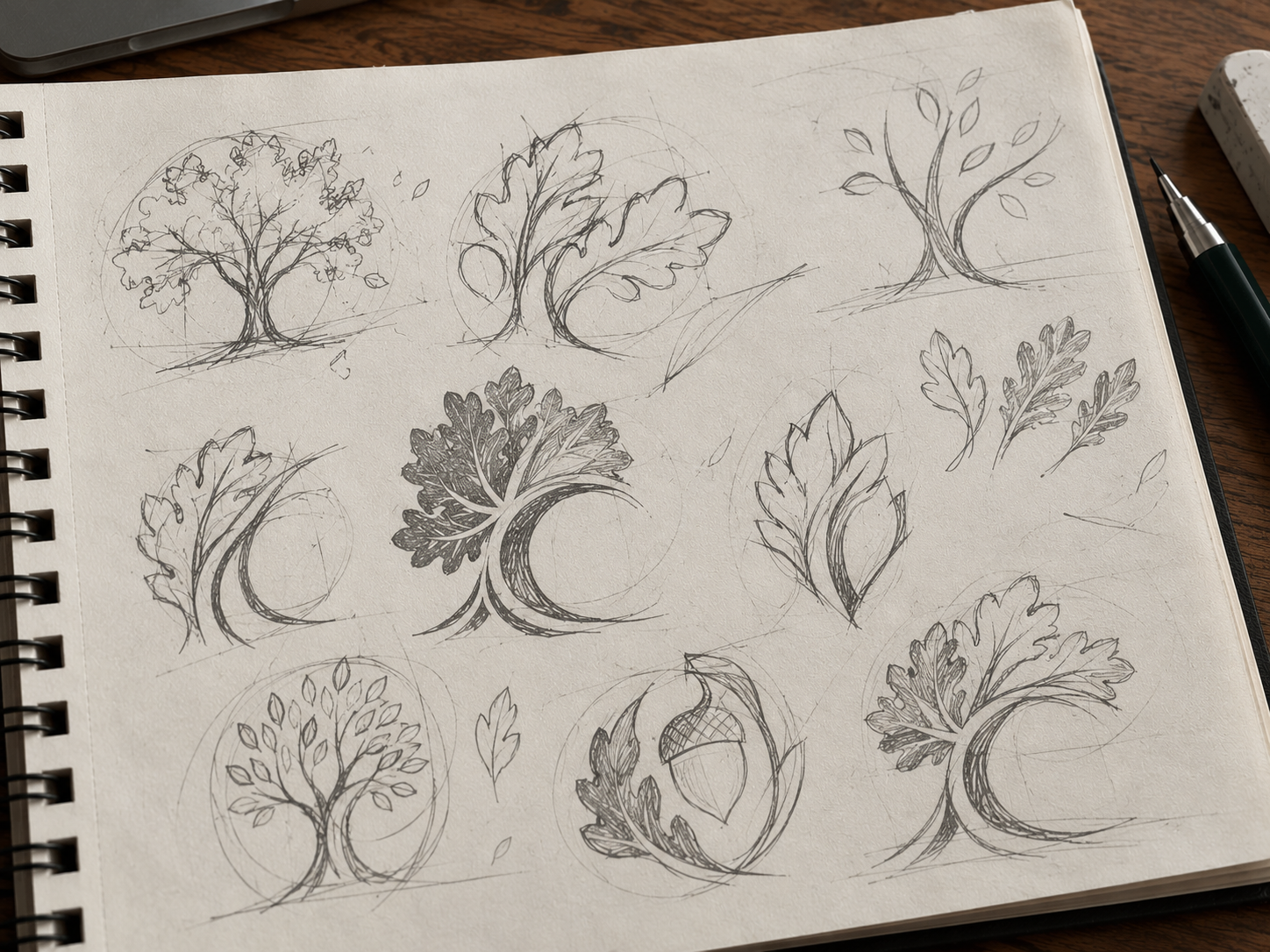
I developed a custom oak tree mark, balancing the organic shape of the canopy with the movement of the trunk and roots. Rich greens and warm earth tones, paired with classic typography, give the identity a timeless, grounded feel. I then extended the visual language across the firm’s stationery and supporting collateral, incorporating oak leaf patterns and subtle graphic elements to create a cohesive brand.
The result is an identity rooted in Mary’s vision for a different kind of family law practice, one built on stability, compassion and the belief that even during difficult transitions, families deserve a thoughtful path forward.
The Inspiration

Mary J. Biacsi, Esq., Founding Attorney of the Family Law Group

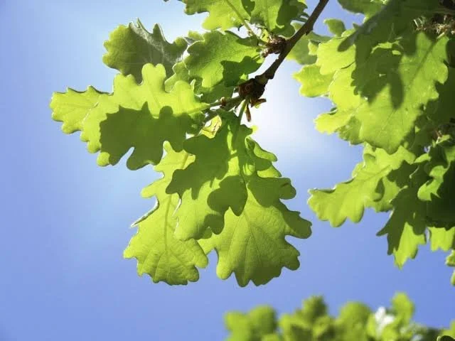
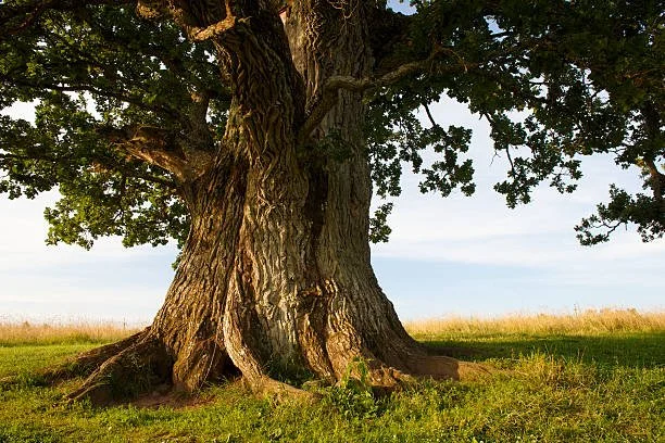
The sun shining through a huge oak tree.
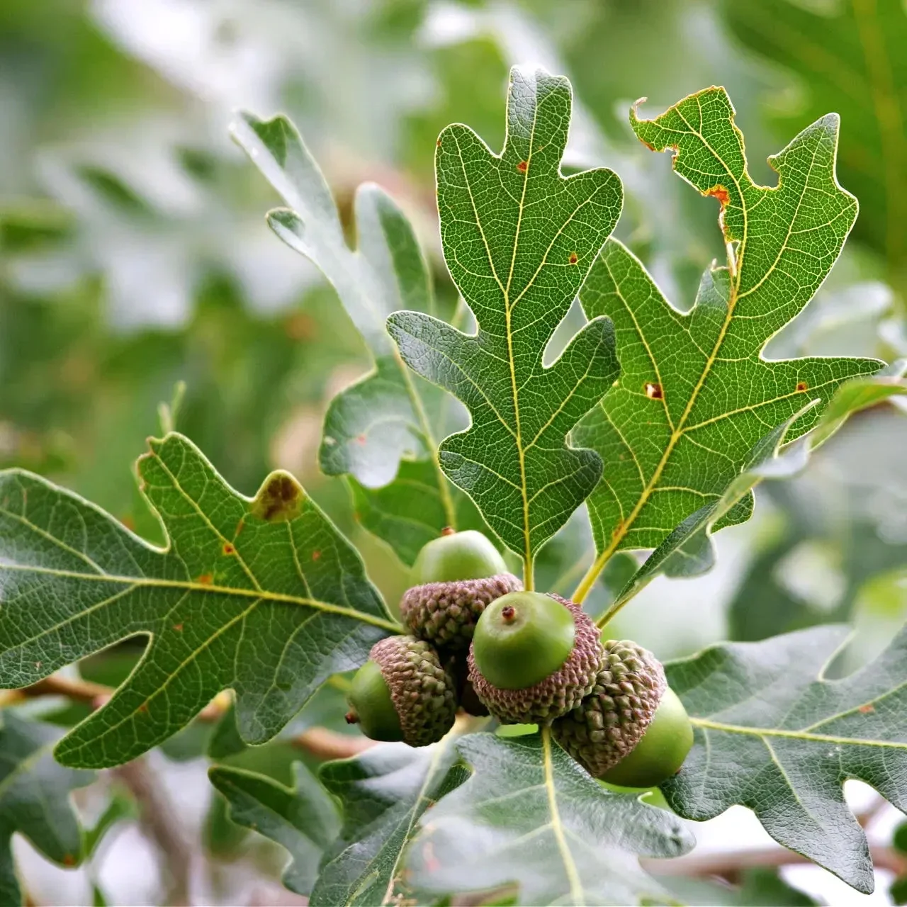
The way leaves fan around the acorns was the main inspiration for the final logo.



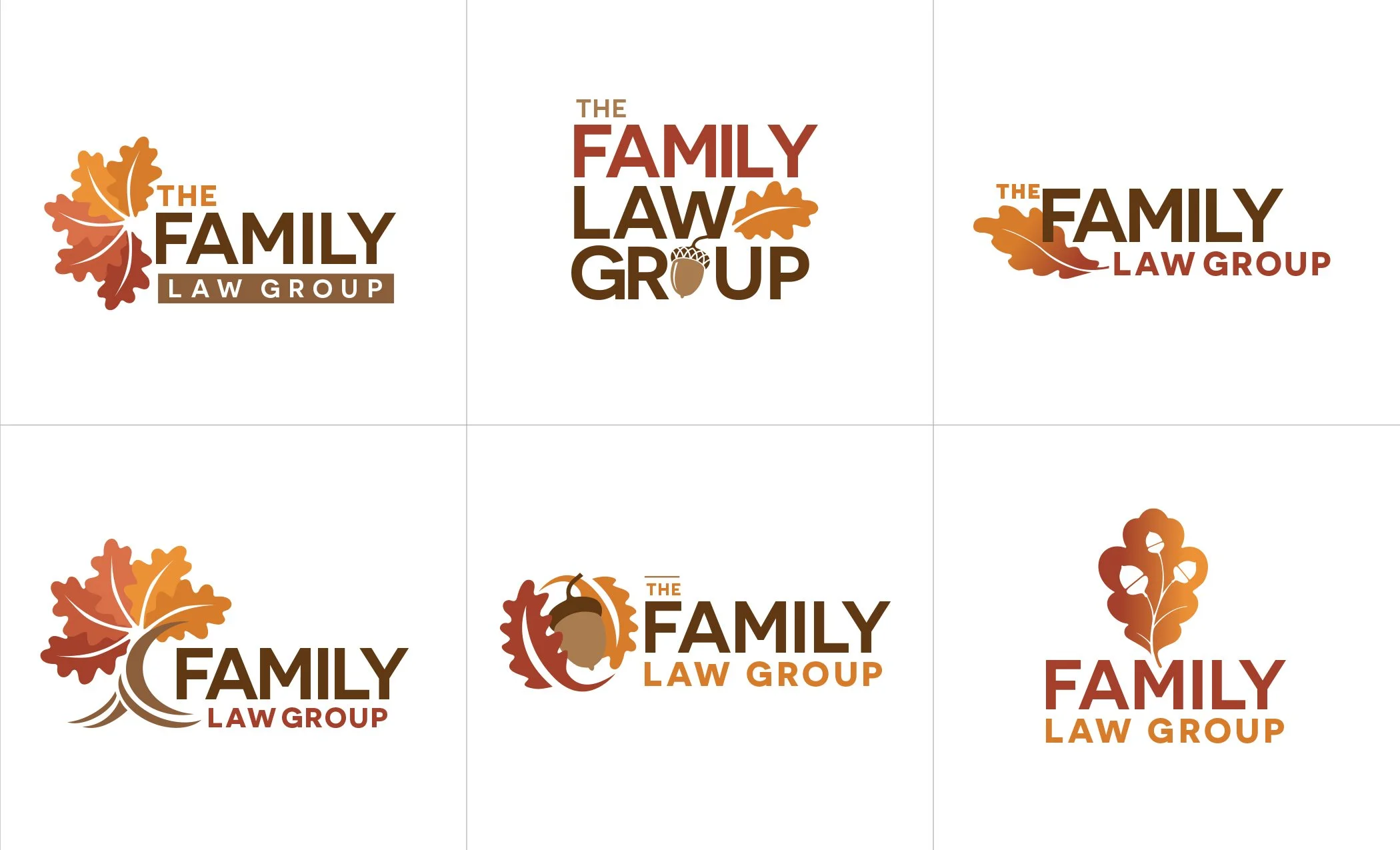
Concepts

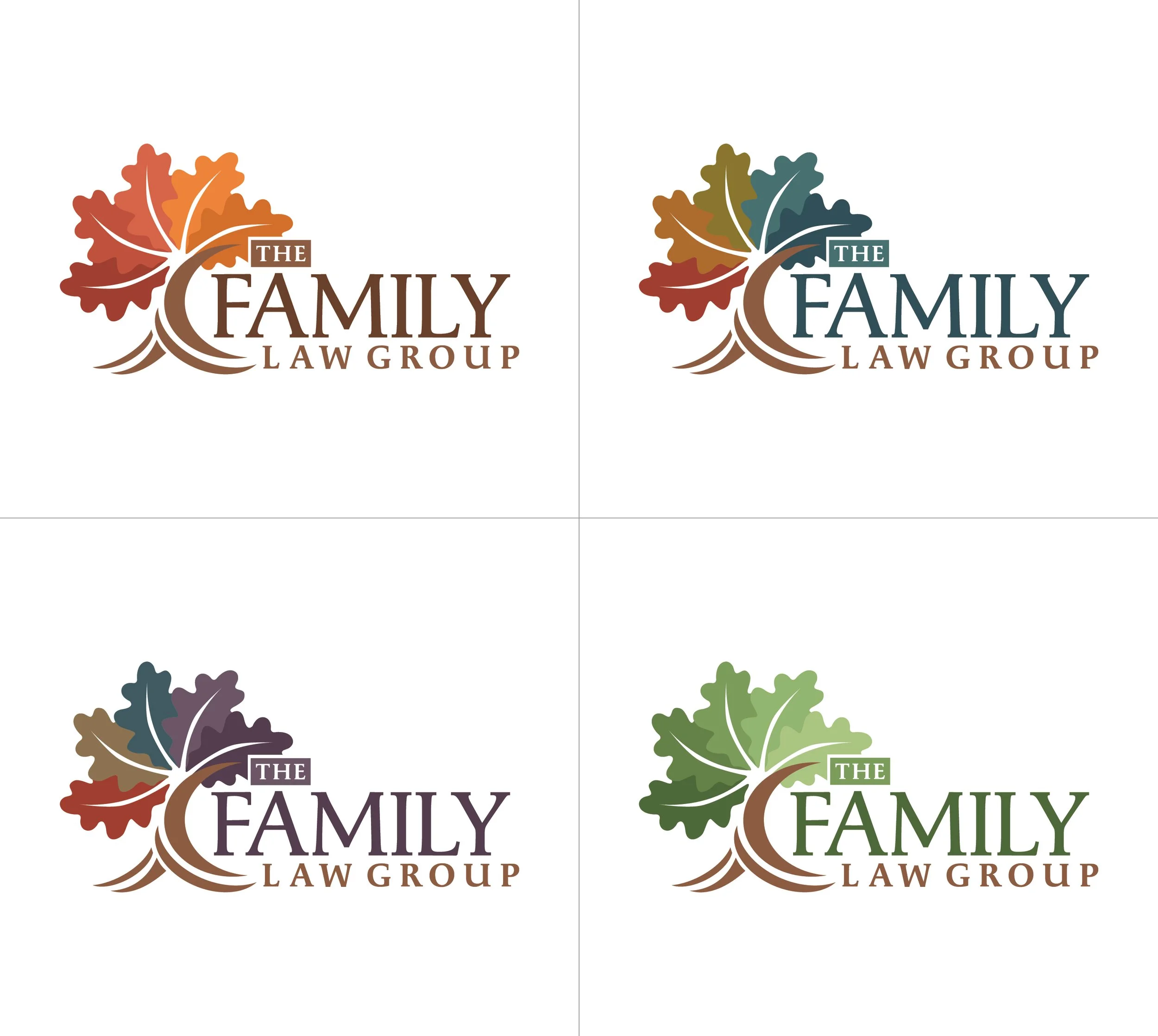
Stationary Suite and Brand Guidelines
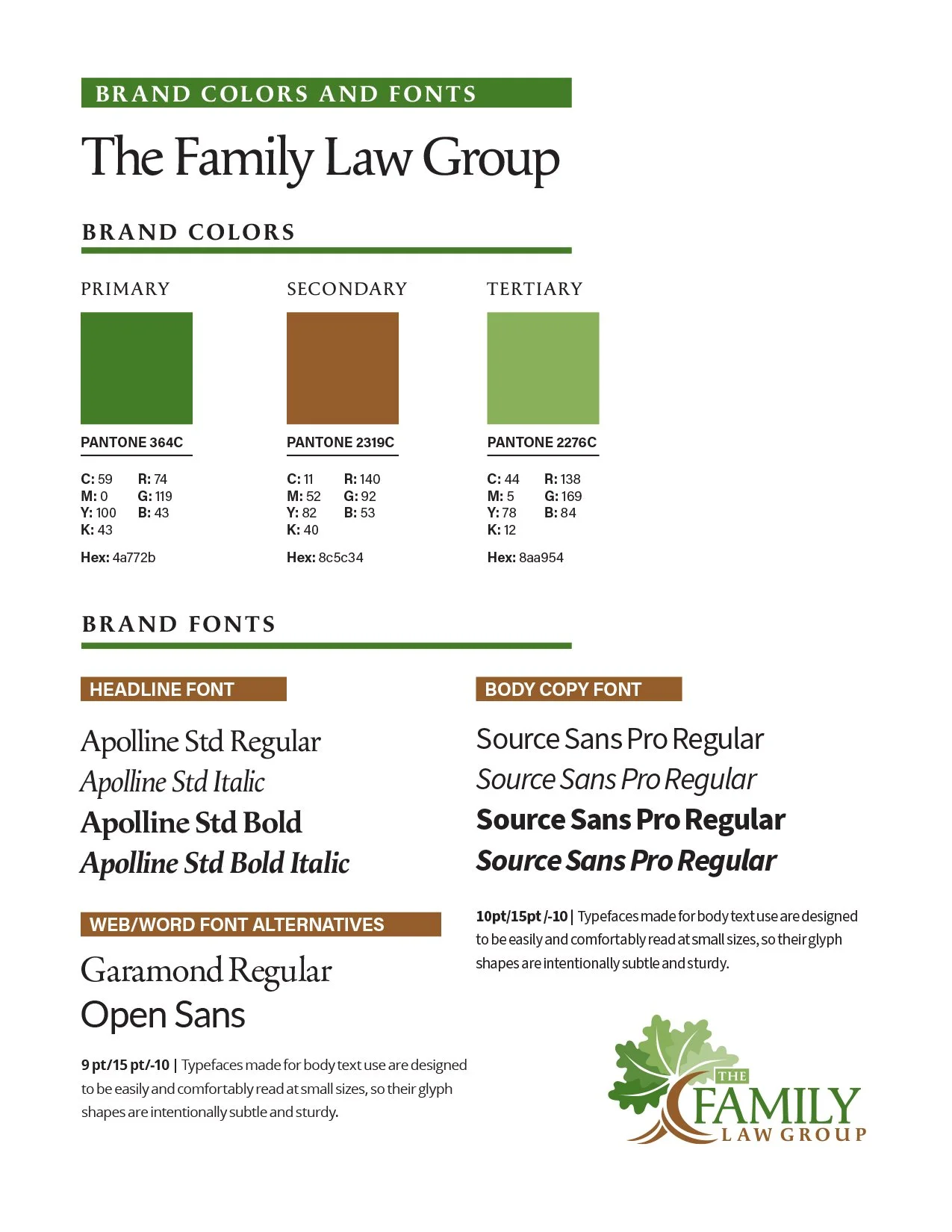
Brand Guidelines
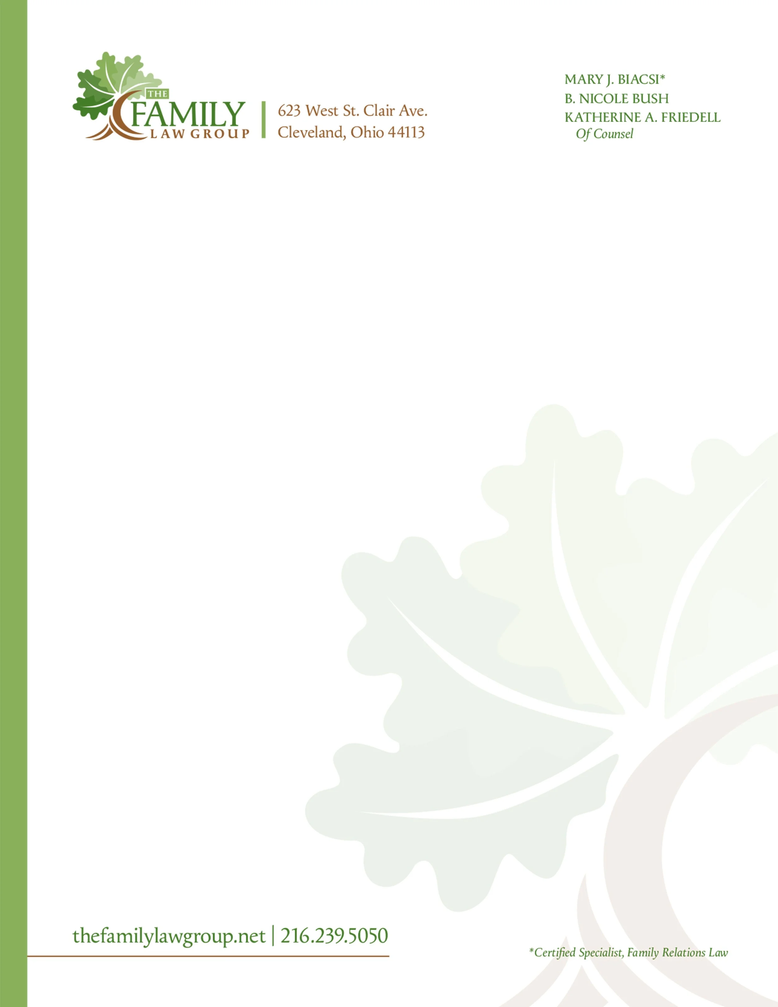
Letterhead

#10 Envelope

Business Card
Outside Notecard

Interior Notecard